On September 2019, I wrote the first version of this blog. It has been a pretty successful run, but it's time to improve it.

To see some context, view release notes for the previous version.
What didn't change
Many things stays the same. For example, this version of the site is still written with Hugo. I have the idea to switch to Zola, which is written in Rust and has cleaner template language, but Hugo still has the best support for Org-mode.
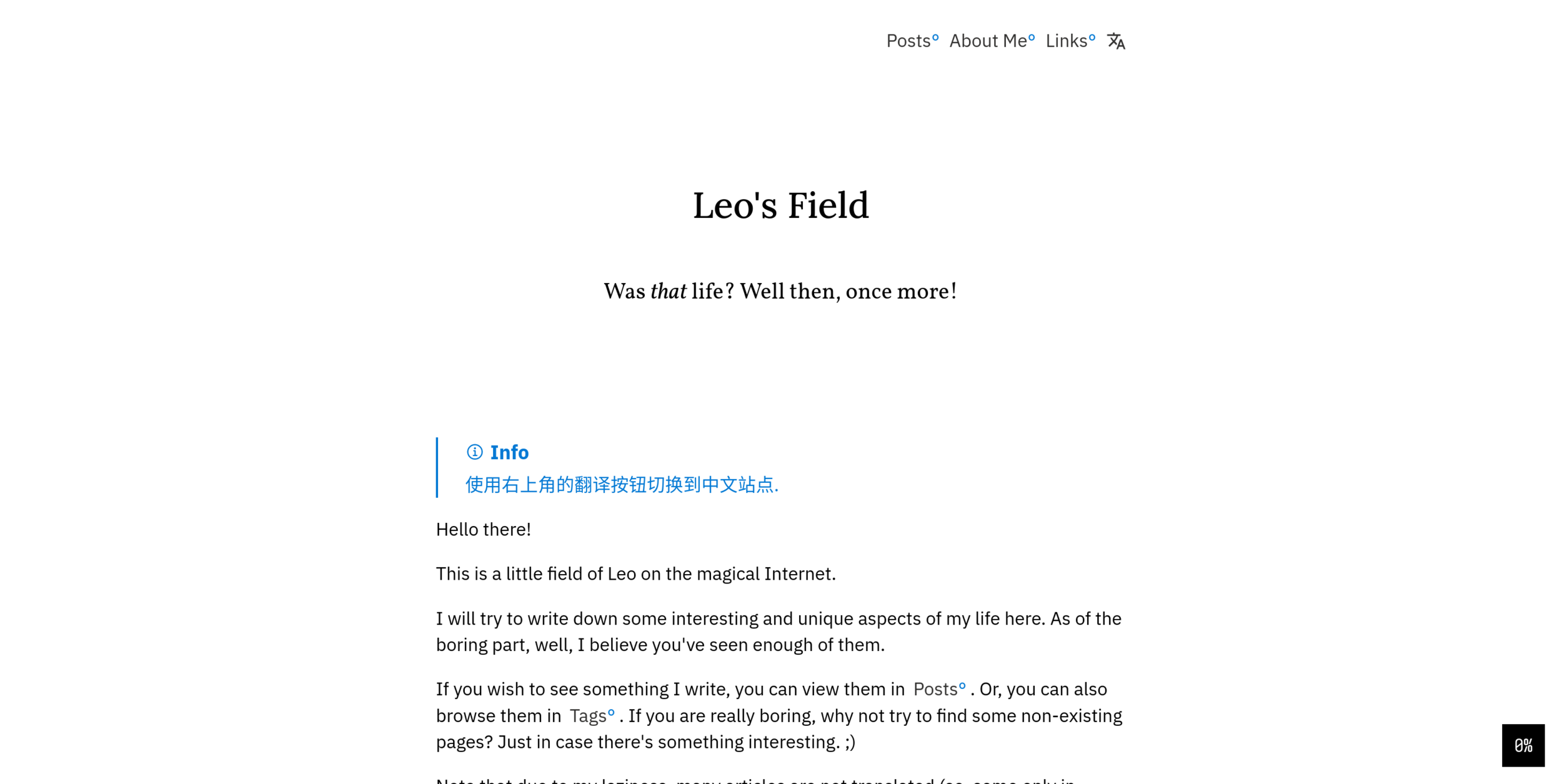
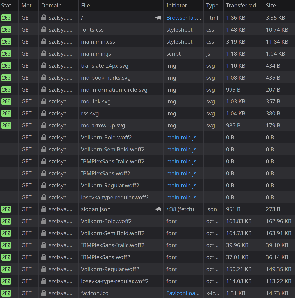
The lack of JavaScript also remains the same. Actually, there's even less JS code on this site—only 35 lines! All other effects you see is created using CSS magics.
Of course, the little percentage/back-to-top button remains. I think it's pretty cool design, especially the animation of the arrow flipping up.
Make it Fast
Since we're still dealing with Hugo, which is a static site generator, we have a pretty good starting point. The web server don't have to render pages whenever someone requests; rather, everything is rendered beforehand, and the web server just need to serve the static files. Thus, the main area to improve is to reduce the size of the files that are needed to show pages correctly.
WebP and AVIF: Modern Web Image Formats
Before, I'm simply using JPG with some compression to keep the image small. However, JPG is not particularly efficient in today's view. WebP has been widely adopted to be the next big web image format. AVIF, which is based on the latest royalty-free AV1 video codec, provides even better compression rate and image quality but is just starting to see mainstream browser support.
So, this rewrite introduces support to both WebP and AVIF. Since Hugo doesn't support either of these formats, I have to write a script to convert them before running Hugo and write special shortcode to detect if these versions of the image exists.
Since many older browsers doesn't support these formats (expecially AVIF), the aforementioned shortcode encapsulate the image in a <figure> HTML tag, where it can specify multiple versions (for example, one in JPG, one in WebP, and one in AVIF) of the same image and let the browser decide which version to use.
Also, since we are using a shortcode already, I also add lazy loading and async decoding to defer the image downloading and decoding process, further improving the page loading speed.
The only issue is that since images live inside a shortcode now, I cannot use native Org-mode syntax to include an image anymore. But considering the benefit, I think it's well worth the effort.
Shrink the fonts
I've been using webfonts since the very beginning of this blog. It's a key part of the visual design, and I'm very happy about how they look. However, it also adds a lot of data to transfer and increases page loading time. Actually, fonts takes up most of the bandwidth during the first load.

Although thanks to caching, browsers only downloads these fonts on the first visit, it would still be nice to have smaller font files.
And it is possible! Since I mainly write in English, we only need English characters and some symbols to display the articles correctly. So, I build a list of the characters that I need, and use pyftsubset to remove everything else.
|
|
Then, we just need to compress them for use in browsers.
|
|
After this process, now the fonts only takes up around 15~20 KiB per font, which is only around 10% of the original size.
Increase cache coverage on CloudFlare
I've been using CloudFlare since the beginning of this blog. CloudFlare is a CDN service that caches resources on the website and delivers the resources in their datacenter, so that the users can access them in their nearst datacenter, thus reducing latency. However, by default, CloudFlare doesn't cache html files (since they are contents of the website and may subject to change). However, since this is just a static site, we can safely let CloudFlare cache everything. And if we do have a modification, we can just purge cache on CloudFlare's dashboard.
In order to make CloudFlare cache everything, Go to Page Rules and add a rule:
|
|
Now, the first response time when loading the page should be greatly reduced, since CloudFlare now don't have to go back to the orginal server to get the page.
Aesthetics Improvements
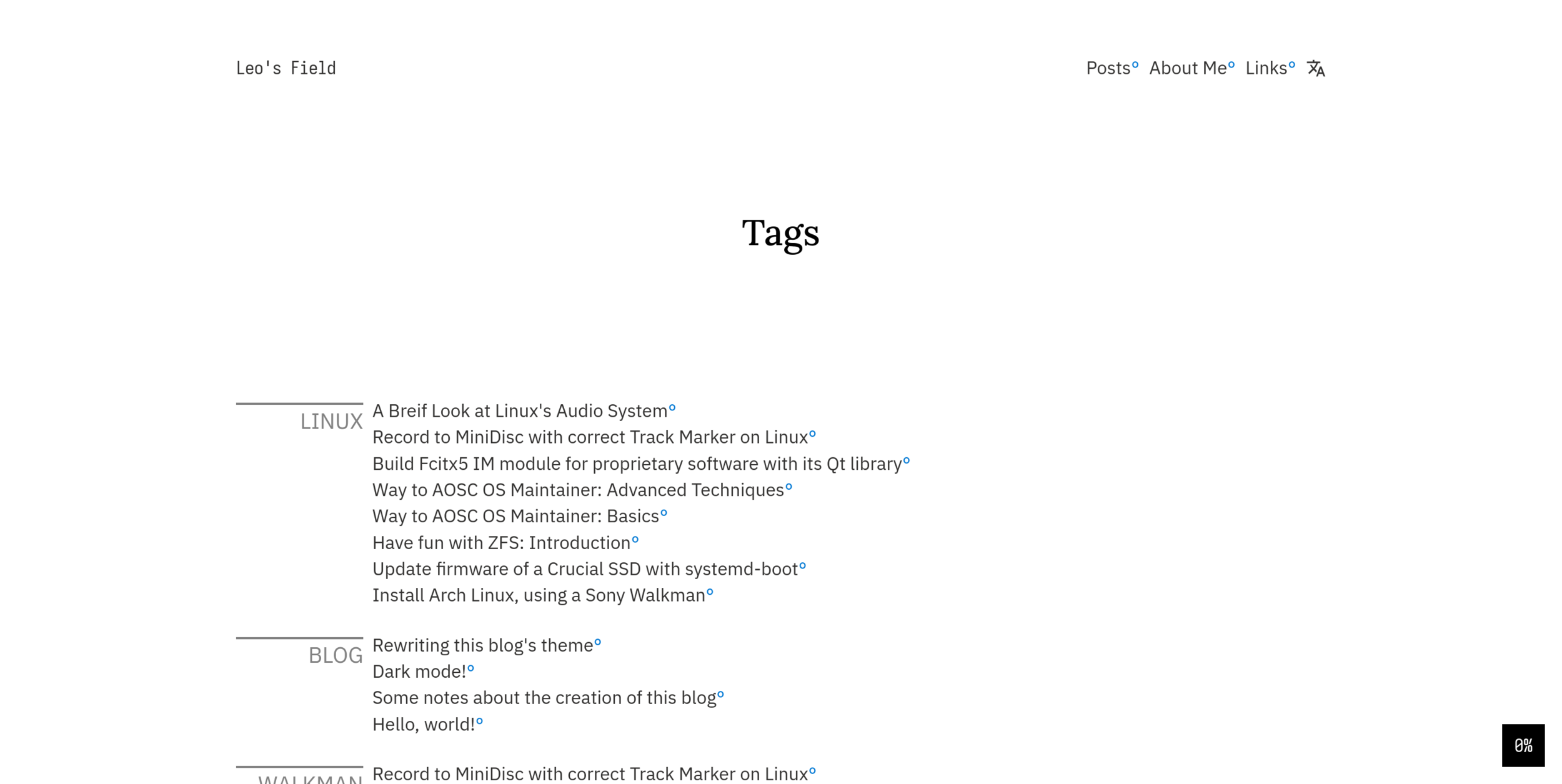
The most obvious change in the aesthetics department is the introduction of double column design.
Typographically, it's favorable to have less than 100 characters per line, so readers can track the line effortlessly. So, that's what I did in the first version. However, this also means there's a lot of wasted space around the text. Thus, in this version, a second column is introduced.
The extra space provides some interesting possibilities. If you have a wide screen, you may have seen the text floating on the left of the text and the image caption on the left side of the image. But there's more! On Tags page, the left column is used to (stylistically) show the tag name, and on Posts list, the left column is used to show the time.

Markup Language
As mentioned before, I'm still using Org-mode as the markup language to write articles. But there's some addition compared to the last version. Now, with the improved btw, card and the newly-developed img shortcodes, it should be easier to write visually-interesting articles.
Font Selections
Fonts generally stay the same on this revision; it's still Vollkorn for Serif, IBM Plex Sans for Sans Serif, and Iosevka for Monospace. There's one addition though: Lora. It will be used for general Serif uses now, while Vollkorn will be reserved for some special purposes.
Dark Mode
Dark mode makes a return too. This time, the background color in dark mode is no longer completely dark, which should provide more comfortable viewing experience.
As always, my dark mode implementation is linked to your system's settings, so the site will follow the system wide color scheme.
Epilogue
And… That's about it! This upgrade is mostly a revision from the last one—a new take based on the same idea: to provide freedom in writing and pleasure during reading. Thus, you may be able to spot a lot of familiar elements from the last revision.
If you are interested in sharing some contents of this blog or seeing how some part of it is implemented, everything you need to build this site (including all articles and source code to this theme) is available on GitHub. Go ahead and take a look!
Happy hacking!